Walls & Frames - How I like to create a gallery wall
Walking into my home a few years was a very different experience to now, the walls were bare, bar the very odd piece of art. Family photos and pictures were only seen on shelves, picture rails and consoles, however over the last two years I have discovered a love for wall hangings and gallery walls, which are now ever expanding across the entire house.

The most recent area was the hallway, which is still in progress. I have had a lot of questions on how I planned this wall, which actually came about quite organically. I initially picked a few family pictures I wanted up on the walls ordered up some frames to fit these from Made.com and started hanging them. I placed 3 on the landing and then worked all the rest around these. I didn't want it to look too structured so mixed the sizes and added the odd white frame and random splash of colour. I have gradually filled it further with a few more prints and love mixing text among pictures. I think the key is not to rush, take your time building it up, so you see what you love on the walls as you walk past and not just something that fills a gap. As you can see mine isn't finished yet, there are still a few gaps...

The most recent picture I hung was actually spontaneously placed, new for me, as most of my hangings are more grouped or structured. I love this effect of randomly filling a space without worrying about measurements or symmetry, this really works if you have something with graduated heights below, the chest and chair really frame the picture making it blend in seamlessly with the rest of the room.

Unlike the hallway the gallery wall in our lounge took a lot more time to put up, endless measuring was involved to create a grid like wall. But the actual planning was easier as all the frames are the same size and style framing pictures of the family. We created this with a view that it would eventually extend across the whole width of the wall, with further images being added over the years as the family grows up. I got these frames from The White Company and all my photos are printed at Sim Lab.
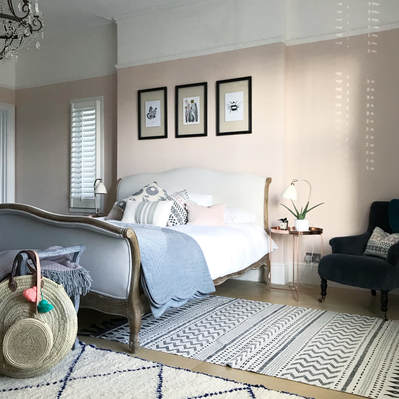
You can't go wrong with a group of 3! They look great above a bed or fireplace drawing your attention to a focal point in the room and adding more interest. Its always nice mixing these up a bit whether it be colour or a varied theme.
I love layering on shelves/ledges and picture rails are a great way to pop and update family photos. I like mixing up the frames on these, different sizes and styles some layered in front of each other. Some people are very strict about mixing colour with black and white, but I actually like mixing the two, it makes the colours pop out and the black and white look more striking.

Where I like to get frames: Ikea, The White Company, GLTC, One.World, Made.com, Brissi and John Lewis
Imagery: a mix of family photos and prints
What I hang with: Usually using picture nails and hooks and sometimes I use command strips for smaller frames.
Where I like to get prints: Cherylrawlings, Junie Poonie, The Little Jones, Will Makes Things, Daisy & Bump, Belle and Boo, Desenio and Slaymyprin.


Comments